Monday, July 15, 2013

A New Day, A New Article

0 comments
So I've got another article for you guys to read, which is right here. It's about online communities in games and how they can be super-cheeky and fun (or total douchebags).

Also, I'm aware almost everyone who clicks on this blog is doing so from the little biography page on the bottom of my articles, so linking the articles here is probably a big waster of time. However, I'm gonna do it anyway, so deal with it.

I am also aware that this blog absolutely, totally, without a doubt sucks and honestly doesn't really have any reason to exist. Weeeeeeell, I'm working hard on something I'm making so that I can have something to show. No details now, but maybe one day there will be.

I'm such a tease.

EDIT: I just realized I gave this the same title as past me did for the last update. Oh well, great minds think alike.

Tuesday, May 14, 2013

A New Day, A New Article

0 comments
Hello  to the people who still read this old thing. As I promised in the last post, I will alert you whenever a new article of mine goes up on GamedevTutsPlus and well, that time is right now. 

The article I've written details five quick (and not so quick) ways to add polish to a game you may think is already completed. It's really just a list of interesting observations I've made about what makes games feel finished versus unfinished. Personally I think the first one is kinda supercool (humble brag) so I encourage you to give the article a read.

Head on over to this link and check it out.

Thursday, March 21, 2013

Hi. I'm Alive.

2 comments
Hey readers (surprisingly there are still around 30 of you a day), this is just a really short post to let you know that I'm still alive.

Like I mentioned previously I got a really sweet gig writing for Gamedevtuts+ (awesome site, seriously check it out). It's been really great, as I've been able to write exactly the same kinds of things I used to write here on their website. Unfortunately, it is exclusive content, so I can't just copy and paste the contents here.

When the school semester ends in May and I restart working on gamedev more prolifically again, I'll post updates on what I'm doing right here on this blog. I don't intend to let it die. So in order to try and put SOMETHING here I guess I'll start linking my articles on Gamedevtuts+ here.

Without further adieu, here is my author profile on Gamedevtuts+. There's a lot there to go through for those of you who liked the stuff I wrote before. Until I have something more substantial to post I'll keep updating this blog whenever a new article comes out.

Stay tuned.

Saturday, August 4, 2012

First Look at And So I Followed My Ears

3 comments
Alright, before I start, I think you should all check out this link here, which is my author profile on the Gamedevtuts+ website I told you guys about last time. I've written 2 articles so far and I like them, and I imagine you will too.

And now  down to business. I told you guys last time that I was dropping my game project as it was boring from both a technical and design direction and I couldn't see myself, or anybody else, wanting to play it. Well, again as I promised I have something new for you now. I present my new project tentatively titled (very, very tentatively, as in I only chose this name because it's the name of the project folder on my hard drive) And So I Followed My Ears. Let's start with a screenshot.


BAM! Checkout that art, that level design, everything here is pure craftsmanship! In all seriousness, what's going on here is the lights are off. This started out as an audio experiment, I wanted to figure out if (while using only stereo headphones) it could become easy to locate a sound in a 2D space. Turns out, after some fiddling only using pitch, left/right panning and volume, it's really easy. So here's where the game comes in. And So I Followed My Ears is a game about sound and darkness. Every level is a room or area in a cave (location liable to change) where the player can see absolutely nothing. There is a torch lying unlit somewhere in this level (exactly one screen in size) and using only the sound that the torch makes, the player needs to locate it and pick it up.


When they do, they get a torch which illuminates the area around them. It also (not pictured here) opens a door in the level that shines a little light (think an open doorway with light on the other side). The player then needs to make their way towards the exit.

This sounds easy, but as always there are traps. Now in the interest of trying to make these posts shorter, I won't go listing all the different concepts I have, but I'll tell you the most basic one. Monsters sleep when the lights are out; they don't move and you can hear them snoring. The sound of their snoring (vicious snoring!) gives away their location and you better stay away from it or death awaits you. When you pick up the torch, all the monsters in the level wake up, but they stay still because they don't know where you are. They aren't snoring any more, and even if they were you can barely hear anything over the flame in your hand, let's hope you've memorized where they were. If you didn't and stumble upon one, they'll roar and start chasing you the second you illuminate them with your torchlight. You better get to the exit fast, because there is no way you are hurting those guys. 

As you can see, I'm going for a sort of suspenseful/horror vibe here. And yes, the audio navigation so far works really well, something that surprised me at first. As a side note, I'm contemplating adding a sort of echolocation style scream your character can do to give you a little bit more guidance in the dark.  Also, to complement the tone and to provide audio context (I plan on introducing all new elements during the blind segments), I've also implemented introspective text, where the character has a speech bubble that pops over him whenever he has something to say. As a bonus it's not intrusive at all because you're paying attention to what you hear not what you see.

Unfortunately, most of the work I've done is stuff you can't really see in screenshots, a light system allowing many different lights of many different shapes and colors on screen at once, a dialog system and lots and lots of sound work for example. There are no shadows right now, and there might never be, partly because any kind of raycasting I've done completely destroyed performance, and mostly because I don't think shadows mesh well with the look-through-walls type of lights I have now.

Well, that's what I'm doing now, hopefully I got one of you at least intrigued by this project. I'll be uploading a video when I get an entire level from start to end finished.

Oh yeah, one more thing. All the art you see now is from Dragon Warrior Monsters. Play that game. It's awesome. Really, really, awesome

Sunday, July 22, 2012

Enemies, Vines and Lava! Oh My!

3 comments
Whoa (apparently that's how it's spelt, I always thought it was woah) guys, I have a massive update for all of you. Here we go. First of all, why haven't there been any posts for a while? Well, that's easy, I've busy working on my game and writing game design stuff. Yup, thanks to my article on 2D cameras and how much you guys liked it, I've been asked to work with the fine folks over at the tutsplus website on their new website GamedevTuts+, which is launching in august. So from now on, you'll be able to find things I've written very much in the same vein as the other articles I've written on game design over at that website (which I'll link too as soon as it goes live). It's been a really awesome experience and it's been really interesting work so far (I mean I just started), so I'm hoping this gig keeps on going for a while. Also, the website looks like it's gonna be awesome.

Now about my game, I've made some pretty sweet progress, I've added enemies, lava and vines. Now the enemies I have were pictured in the last post, and they're pretty much just goombas, running back and forth because that's just how smart they are. The thing is, you can't kill them with your gun, in fact you can't kill anything with your gun, so you have to squish them with blocks to get them out of your way. Also, they kill you instantly if you touch them (right now).

There he is again

Next, the vines are pretty cool, they're essentially a foreground block, that only enemies and the player can pass through, as in they act like solid blocks for  any moving blocks. Their purpose is to act as a sort of safe haven for enemies where they can't be squished by falling blocks. The player can shoot the vines though, and after a couple of hits they break allowing the enemies to then be squished.
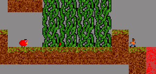
It's a little hard to see the enemy behind there,
 but they are very obvious in motion
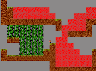
There's also the lava, which instantly kills any player or enemy it touches and burns vines, rendering them charred, which makes them break with only one shot. Also, any downward-falling block that comes into contact with lava floats on it's surface for a few seconds before melting, the idea is that the player can create temporary bridges to cross the lava. Finally, and this is where I spent the vast majority of my time, the lava flows. It flows in a sort of sticky manner, getting jammed up on the ground and on other pieces of lava, but this was intentional. When it acted too liquidy it often blanketed an entire area and it was impossible for the player to pass. The lava flows using basic cellular automata, mostly because I didn't want to have to bother with the lava tiles having knowledge of anything that wasn't directly beside them. 
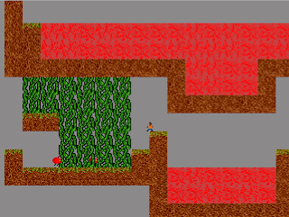
Here's the stagnant lava

And here's the flowing lava

The flow algorithm isn't really complicated, but it took a lot of time to iterate to get it to where I wanted it to be, because I really didn't want it to just act like water. In fact, it now acts more like you'd expect sand would in a game (and the algorithm is pretty similar to what you find in those falling sand style games). The biggest thing though, was getting the game to run without, as I still don't know how big levels are going to be, there is the possibility of there being lots and lots of flowing lava tiles in one level. I fixed this mostly by thinning down the comparative checks in the algorithm, but also by putting a system in place to check different bodies of lava and check how far they went off screen. If there was any lava tile that was not part of an active on-screen pool, they would be ignored during checks. I also slowed down the flow of lava and only let the lava check for collisions at specific intervals rather than every tick of the update loop. 

Obviously, any coders out there know that speed wouldn't have been a big problem if I had simply kept some sort of byte array to check whether tiles had lava, because "collision" in this case would have been very simple and extremely efficient. Unfortunately, with the way Flashpunk works, it was just easier for me to do things this way, keeping each lava tile as something Flashpunk call an "entity". It's not efficient at all, but it's what I chose to do and it works perfectly.

Another thing worth noting is that I completely re-coded the level editor, so it's now really easy to add new objects to the palette, all I need to do is write the class name of the new object in a string I have saved in the level editor class and it works perfectly. This definitely saved me a lot of time.

Finally, I'm sure you can all tell the graphics were significantly improved. It's still all placeholder stuff, but I was getting tired of looking at metroid tiles and I needed some sort of graphical cohesion to tie all the elements I was making together.

Unfortunately, here comes the bad news, I'm really not at all interested in this game. I initially started all of this because I had lots of ideas in my head but none of them reached whatever high design standard I was arbitrarily holding myself too. I decided then to start making a simple modular 2D engine in Flashpunk so that I wouldn't waste my time. Well, I sort of hooked on to an idea while making this, but the more I think about it, I'm just not at all excited by it. Technically, this isn't anything very interesting or difficult, and conceptually I see nothing special about what I've started making so far. As someone interested in design it's missing that "hook" or any kind of cohesive vision at all, and as a gamer the small amount of direction I have in my head just looks like it's going to make a boring final product. Basically the game looks lame. It took me a while to notice this because I've been very busy, as I'm moving to Montreal in a month (transferring to McGill) and it's been time consuming trying to find a place and get all my transfer credits approved by the various faculties.

Anyway, what I'm going to do now is start thinking again, what I've coded is absolutely in no way useless, in fact I could do pretty much anything 2D with a grid-based map while barely throwing out any code at all. Hopefully next time I post I'll have something cool for all of you to look forward too.

P.S: I'm going to try and post more frequently to avoid wall-o'-texts like this one.

Tuesday, July 3, 2012

Stay Awhile and Listen

0 comments
Wow. Reddit rocks. I posted a link to my blog on the gamedev subreddit of reddit.com and went from 50 to nearly 3000 page hits in one day.  Not only that, they haven't just been reading my posts, they've been commenting too and have spurred some really interesting discussion over on the reddit thread.  I've also been getting around 40 views a day ever since,  and I haven't even written anything new! Well, here is something new, though it's probably not what you were expecting.

Since I have readers now, or at the very least people who stumble into to this blog on their way to greener internet pastures, I figured I'd let you guys and girls know how I'm planning on updating this blog. What I mean rather, is when I'm going to update this blog. I find blogs typically update on a weekly basis, but I don't think that's for me. I wan't this blog to be interesting and stimulating, and let's face it, interesting thoughts, or gamedev milestones worth talking about, don't happen like clockwork every week. Sometimes updates will come more frequently, and other times less frequently. What I'm saying is, I don't want to write something unless it's something of substance, something I believe is of some kind of value to people. I like making and talking about video games, that's not unique, but hopefully my perspective and thoughts can be, and that is what this blog is about, not a weekly view into my gamedev life (unless that's what you want it to be, in which case, let me know).

So, it's worth mentioning that this post is breaking that golden rule, but I have a good reason for that, I promise. I just got a lot of people to look at my blog in one burst, and looking at the page visit statistics Blogger is giving me, people are either coming back to see if there is something new, or people really like reading the seventh page of r/gamedev. This post is just to let the people from that first scenario know that this blog isn't dead and I will be posting on a frequent, yet irregular, basis. The easiest thing to do is probably to follow me by e-mail using the widget to the right of this post. Don't worry, I don't get to see what your e-mail is so I couldn't send you creepy unwanted love letters even if I wanted to.

I was initially going to post about what I got done this week, but I have now (clearly) decided against it for all of the reasons I mentioned above. Well, that's a lie, I will show you the most incredibly awesome thing you have ever seen. Seriously.


Okay, maybe it's not that awesome. Maybe it looks a lot like that red Angry Bird (does it have a name?). But the important thing is that I drew it and it doesn't look like something that came from the bowels of hell designed to torment people who actually know how to draw. I think it looks decent, and the little jumping animation looks nice in action. Even though it's just a pretty placeholder for now, I like it.

Well, that's it for this post, hopefully I cleared up some things for people wondering why there was nothing new to read. Thanks for reading, and keep coming back it's going to be awesome. 

Monday, June 25, 2012

My View on 2D Platformer Cameras

1 comments
Everybody knows games live and die by their camera. It doesn't matter what the nature of the game is, if the camera isn't able to properly frame the action, the player will undoubtedly get frustrated and the game ceases to be enjoyable (obviously this is more common in certain types of games, for example I've never played a Tetris game where I was upset by the camera). This being said, talk of cameras is usually reserved for 3D games, and very rarely do you hear talk of how the camera is handled in a 2D game. Maybe this is because 3D camera work is inherently more complicated, or maybe even that relatively bad 2D cameras are usually not the end of the world and the games are still playable. Regardless, Internet, prepare to be enriched as I am going to post my dissection of camera work in 2D platformers as well as how all this applies to the game I am making.

Why is the Camera so Important?

As I said earlier, the camera is important because it frames the game. The camera, which is just a word for the visible area rendered to the screen, is the player's only gateway into the world you have them playing in. Skew their view too much in one direction, or make their character difficult to follow with a constantly adjusting camera and the play experience is seriously hurt. It's very simple: a player can't react to what they can't see, and a game is no fun when you aren't given the tools or time necessary to react to a situation, and is even less fun when you don't even know what that situation is in the first place. Nobody likes being killed by off-screen enemies or falling into pits that were hidden below their field of view.

How is it Usually Done?

First of all, we have to realize that there are two popular types of platformers each with their own typical camera system. There is the sidescrolling platformer, which usually uses what I like to call a floor-locked camera system, meaning there is little to no movement on the vertical axis and the floor is visible at all times. This type of camera system also usually strives to keep the player in the center of the screen on the horizontal axis (with some games allowing the camera to lead the player somewhat). This works very well in most cases, as the typical primary ability of a platformer character is jumping, which requires vertical visibility. This system is also elegant in it's treatment of the staple sidescroller danger known as bottomless pits as the player knows that any fall going past the bottom of the screen will result in death, avoiding the common annoyance a player faces of deliberately falling down a bottomless pit thinking they will survive (spoiler: they usually don't).  Obviously, as sidescrollers have grown in complexity over the years, the rigidity of this system has loosened significantly and minimal vertical scrolling has been introduced. However, the essence of the system, always keeping what the player is standing on in clear view, has not disappeared.

The NES classic Super Mario Bros. is a prime example
 of the floor-locked camera system

The other most popular type of platformer is the open-world platformer, where levels are non-linear and players are free to explore in every direction. The vast majority of these games use a camera which directly follows the player, attempting to keep him in the center of the screen (or near the center) whenever possible, I call this system player-locked. Often these games also have certain areas like boss fights or smaller rooms where the camera behaves in a more traditional sidescroler manner. In my humble opinion, this system is functional yet flawed. It is functional in the capacity that it allows the player to see equally in every direction, something that is important as the player can be expected to move in any direction at any given point. As a side note, this is much better than a heuristic camera (where the camera tries to predict where the player will be, based on his position and velocity) because it is predictable, something that is very important as an unpredictable camera feels chaotic and annoying. The system is flawed however, in that it very rarely frames the action in the most appropriate way. Typically platformer characters can jump very high and it is not uncommon for the camera to track them in such a way that at the peak of their jump the player can not see where they were standing. This makes any kind of horizontal jumping (jumping across a gap for example) needlessly frustrating as the player needs to remember where platforms are so that he does not overshoot or undershoot them. It is much more enjoyable for the player to be able to see his desired landing point for the entire duration of a jump. The other big problem with a player-locked camera is that it moves around a great deal and feels especially jerky during the typical rapid upwards acceleration of a character's jump.

Super Metroid for the SNES uses a mixture of the floor-locked and player-locked camera 
systems based on the type of room the player finds themselves in

What Happens When it Goes Wrong?

Though I've gone over why the camera is important and the problems a bad camera can cause for the player, I just wanted to use this section to present a concrete example of what a broken platformer camera looks like. Here is a video of Frogger Advance: The Great Quest, for the Game Boy Advance. The game is a sidescroller but uses the player-locked camera system and it seriously hampers gameplay. You will see in the video that it is extremely difficult to judge jump distances as when the player is in the air they cannot see the platforms beneath them. I would wager a guess that without the floating mechanic (where Frogger slowly floats downwards) the game would be unplayable due to the large amount of player deaths caused by the platforms being off-screen. It is worth noting that the camera is not the sole cause of this issue, the enormous character sprites on the small Game Boy Advance screen also add to the difficulty in seeing what is around the player. Earthworm Jim for the Game Boy Advance is another example of large sprites on a small screen with a player-locked camera seriously hurting a game.

There are very few videos of this game on YouTube, but this one
perfectly sums up the issued with the game's camera

So What Did I Do?

As I said yesterday, my game is a platformer with semi-large open levels in which the player can move in any direction. I did not, however, use the player-locked camera system because of the flaws I presented earlier. Instead, I opted for my own system (and this being 2012 I'm sure it's been used before, and has a name, and a wiki about it) that I call a platform-locked camera system. What I initially did was created a rectangle around the player (a window if you will) that could be moved by the player pushing against it's edges both vertically and horizontally. The camera was tied to the position of the window, not the player. This allowed the player some leeway in vertical and horizontal movement without affecting the camera, which I thought was important in making the camera feel stable rather than chaotic. I noticed, however, that this brought up an important issue regarding the rectangle's size. If the rectangle was too short, the camera would still scroll vertically when the player jumped  (again I don't want the camera moving that much). The obvious solution was to make the rectangle taller, but this caused the player to have too much vertical movement when falling before reaching the bottom edge of the rectangle, not offering the player enough downwards visibility. 

So what I have implemented currently is a mix between the floor-locked system and the window system. This system keeps the same functionality as the window system on the horizontal axis, but works differently on the vertical axis. Vertically, the camera keeps itself locked to the height of whichever platform the character was last standing on provided the player stays at that altitude or higher. If the player drops below the platform, the camera will follow him until he lands on a new platform. This allows the player to jump without the camera moving to follow his accelerated upwards momentum and gives a very smooth result (in my humble opinion). 

There was one last question, however, and this was where the player should be located on the screen (for example, the center of the screen as seen in the player-locked camera system). I decided to keep the player on the bottom portion of the screen (centered horizontally) and allow him to look downwards when standing on a platform (with the down arrow key). I chose this position for the simple reason that the player has more control when going upwards (as jumping is the primary means of movement) and should therefore be able to see more of what lies ahead. Given that the camera is locked to always allow the player to see any platform he is trying to jump to laterally (and downwards to a certain degree), the only time the player must move long distances downwards is if they are deciding to fall off a platform. If they chose to do this they can simply look down before committing to their descent.

This will all make more sense when you get to try the system, which incidentally happens to be right now. Keep in mind all art and sound and level design and everything else is place holder. (NOTE: There is a noticeable frame rate drop when uploaded for some reason, I will find the cause later and eradicate it)

CONTROLS:
Arrow Keys or WASD to move (Down Arrow or S to look down)
X and C for the two bullet types (explanation of this mechanic is in yesterday's post)
T to toggle visibility of the camera rectangle


EXTRA CONTROLS (you don't need these, but they are there)
Press Escape to toggle in and out of editor mode
Hold down F to enable fast scrolling
Use the mouse the place blocks
Hold control and click to remove blocks
Press E to clear the screen
Use Space-S and Space-O to save and open a level

And that's what I think of platformer cameras, I'd be happy to hear your thoughts on the subject in the comments (found below the post's title).